Project · Brand · 2024
Rebranding a Mexico City coffee chain
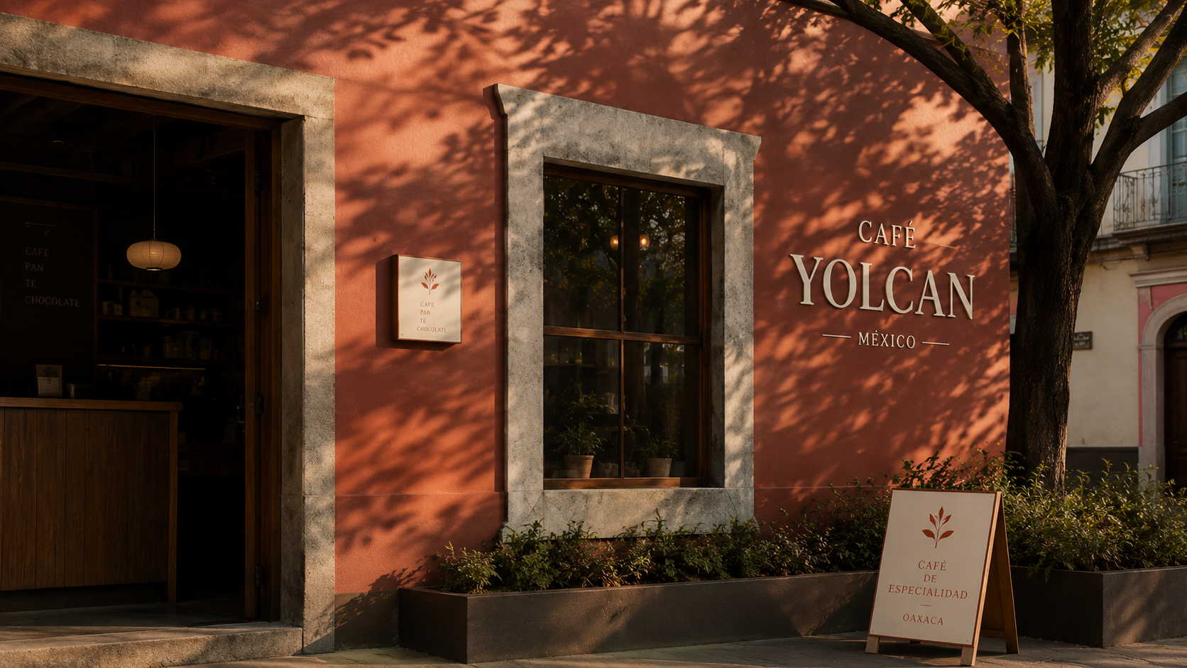
A nine-shop independent coffee chain founded in Roma Norte in 2014, growing into Polanco, Condesa, and Tokyo. The expansion brief was the reason the rebrand became a rebrand.
The brief
The client came in for a refresh — new packaging, a sharper signage system, a tidier set of digital templates. Three weeks in, the conversation had moved to whether their visual identity could carry to a Japanese audience without becoming a different brand. We changed the brief.
The approach
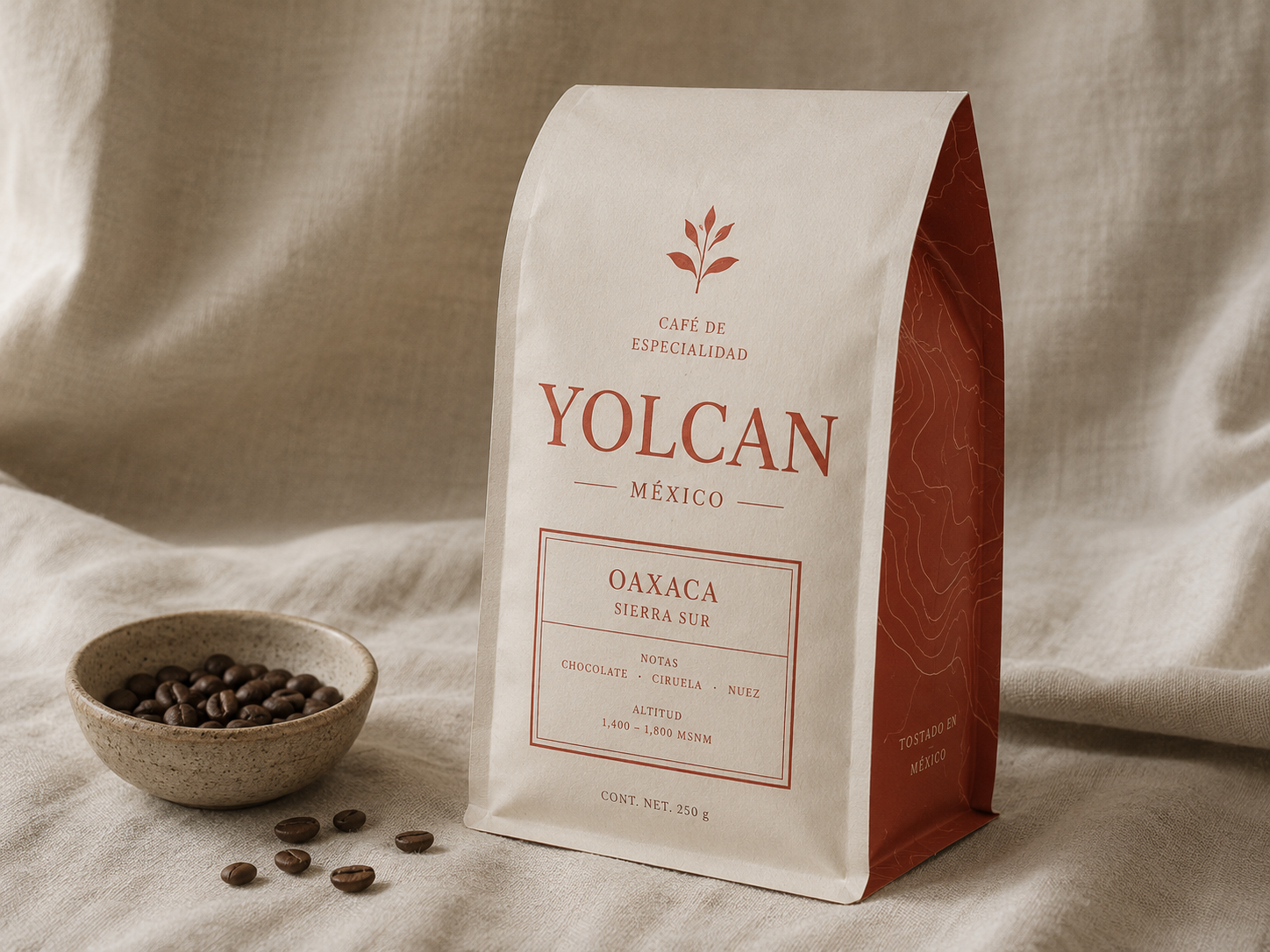
We started with the words. The chain’s voice in Spanish is dry and a little professorial — that didn’t translate cleanly to either English or Japanese without sounding stiff. We built a small bilingual style guide first (then trilingual), and used it to test every brand artifact through translation. The visual system followed: a wordmark that worked in display-weight serif and a single CJK glyph; a packaging grid that gave Japanese vertical setting an honored slot without making it feel grafted on.
Deliverables
Trilingual style guide. Wordmark + secondary mark. Packaging system across cups, bags, and merch. Wayfinding for the first Tokyo location. Brand book in EN/ES/JA.
Project
Client
Independent specialty coffee chain
Year
2024
Locations
Mexico City + Tokyo
Roles
Brand strategy · identity · packaging · wayfinding · trilingual style guide